uniform design + branding
problem | Design a custom uniform for Notre Dame Hockey in celebration of their trip to Belfast, Northern Ireland, and placement in the "2024 Friendship Four" collegiate hockey tournament.
solution | Take the purest expression of the Notre Dame brand, blue and shiny gold, and infuse it with a story that honors Ireland's history and culture. The design is based on the Book of Kells – an illustrated manuscript of the four Gospels dating back to 800 AD – one of the world's greatest works of medieval art and a hugely significant part of Irish art history. The uniform features a custom number set, shoulder logo, and font all directly inspired by illustrations in the Book of Kells. A Celtic rope knot based on the Notre Dame Founder's Lines runs through the jersey sleeves and numbers.
(See the project "Notre Dame Football + Dublin Ireland" for more information on the Founder's Lines knot).

| gameday: the friendship four tournament |




| design process |
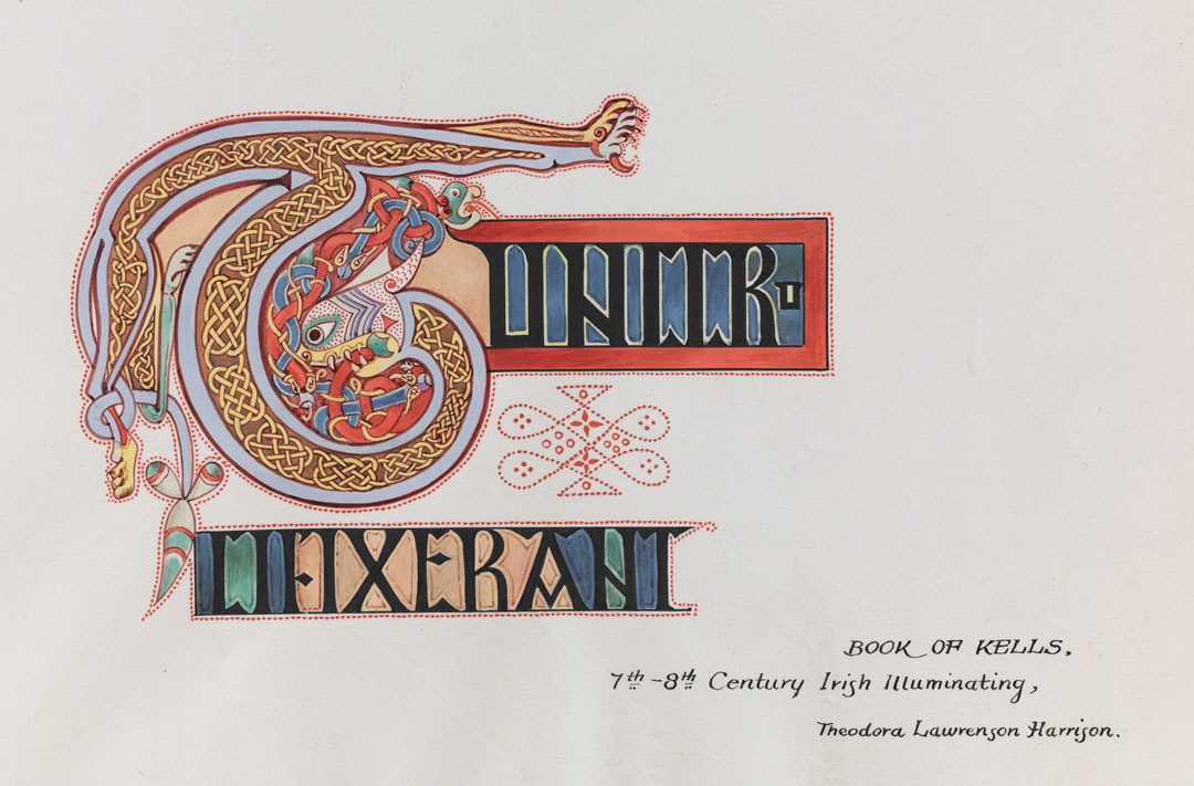
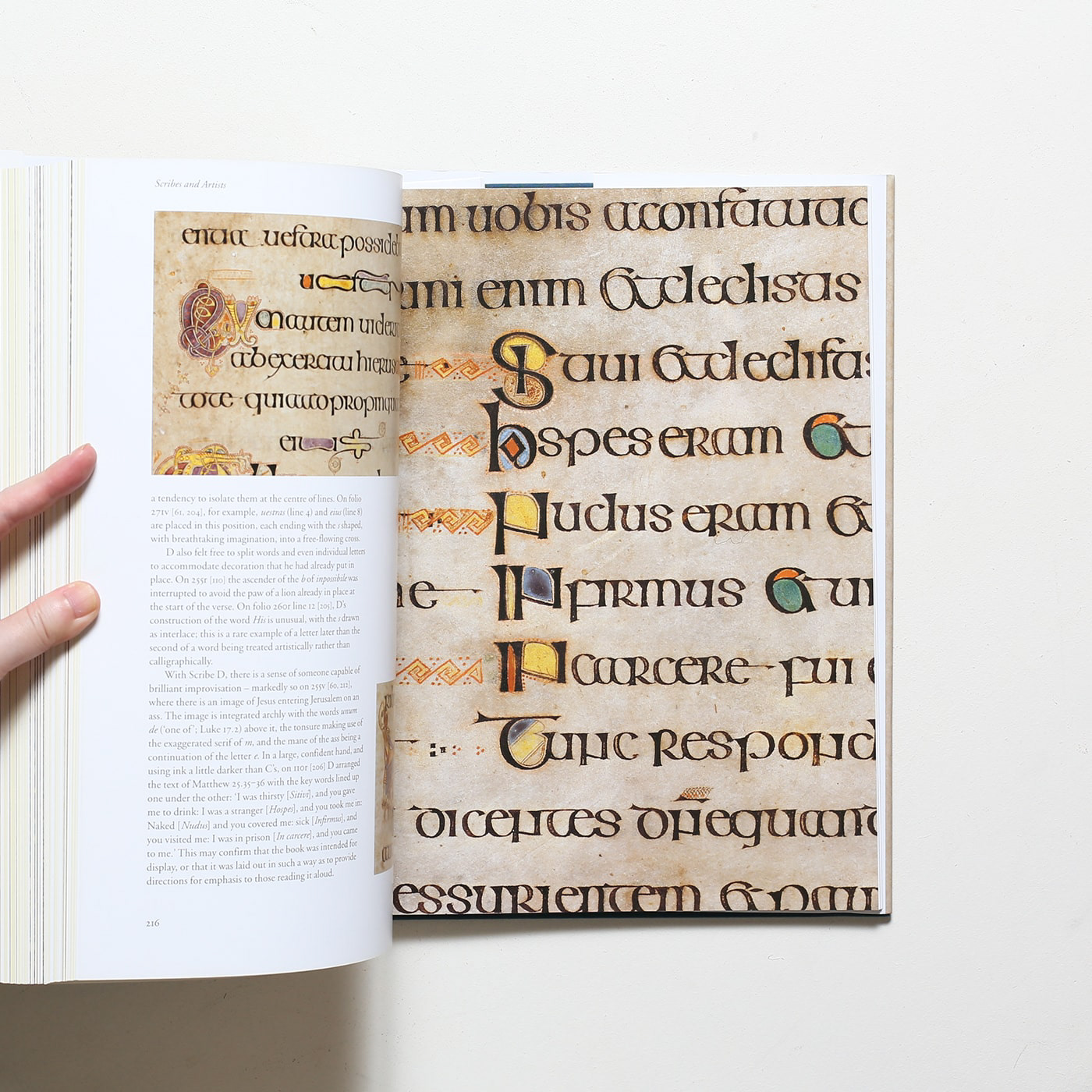
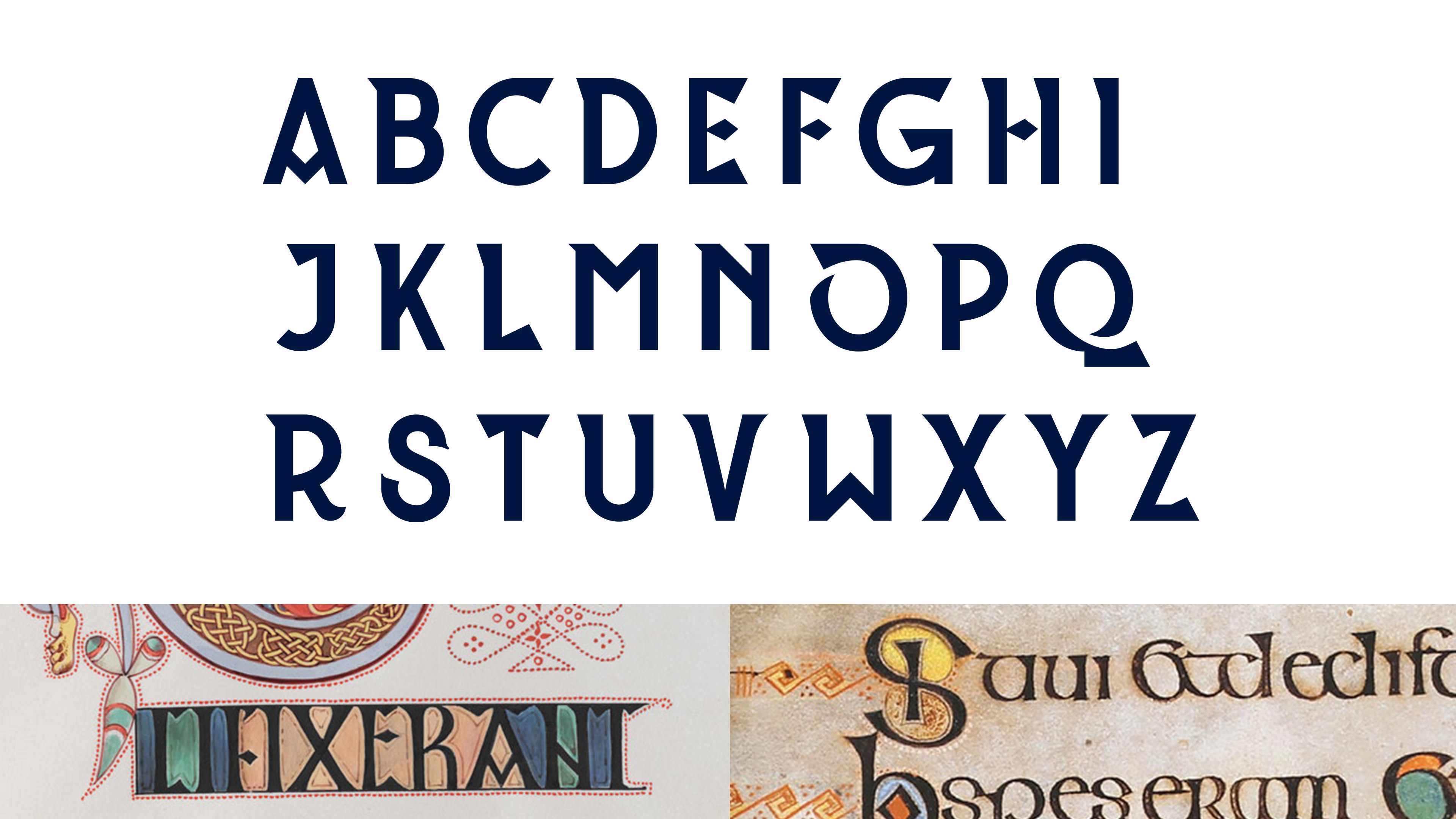
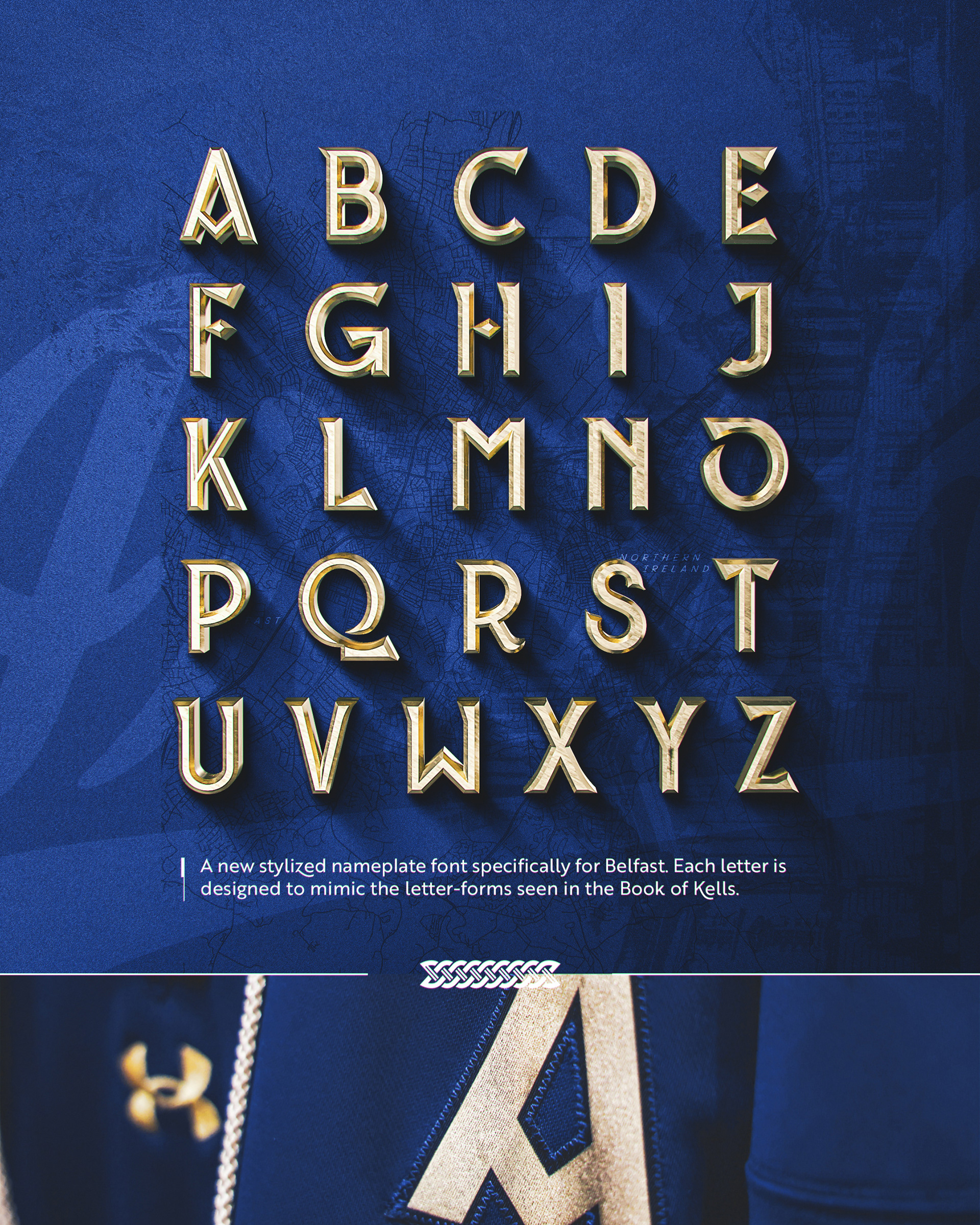
above: the uniform font design uses "Ferghaus Sans" as a loose base for the letterforms, with each character significantly modified based on the variety of type styles seen in the Book of Kells.
below: sketches showing the process for developing the final number system, and the Book of Kells inspiration used for the design.
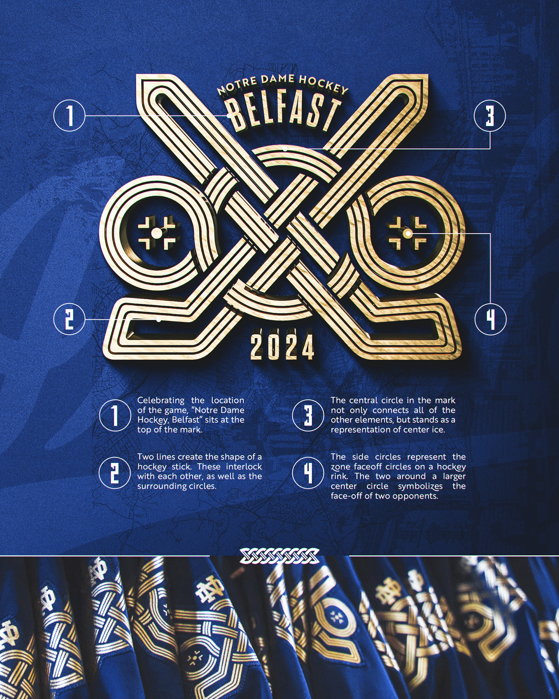
above: the process for designing the uniform shoulder logo, a Celtic knot specifically for Notre Dame Hockey. the circular knot design shown to the left from the Book of Kells was highly reminiscent of hockey's four face-off circles, which launched the concept for the logo.
below: the final photoshop rendering of the uniform design.
Creative Direction & Design: Emma Schneider
Manufacturing: Notre Dame Hockey, Under Armour, and Exclusive Pro
Photography: Courtesy of Notre Dame Athletics
